Physical Address
304 North Cardinal St.
Dorchester Center, MA 02124
Physical Address
304 North Cardinal St.
Dorchester Center, MA 02124

Your emails are just collections of words, sentences, and characters. But the characters are collections of email fonts. The reader will read it if they are impressed or influenced by your font.
Because your email font is the base of your email, you should devote the same time and effort to it as you do to your copywriting. But not all fonts perform equally in an email campaign. While less secure web fonts may cause your designs to be overlooked, the best email fonts will make your email campaigns stand out.
That’s why email marketers focus on email-safe fonts and professional email fonts that render consistently across Gmail, Outlook, Apple Mail, and mobile devices. Now selecting the best fonts for professional emails for your campaigns doesn’t need guesswork. We offer the fonts you need for every purpose, whether you’re upgrading your company email signature or creating a new email newsletter.
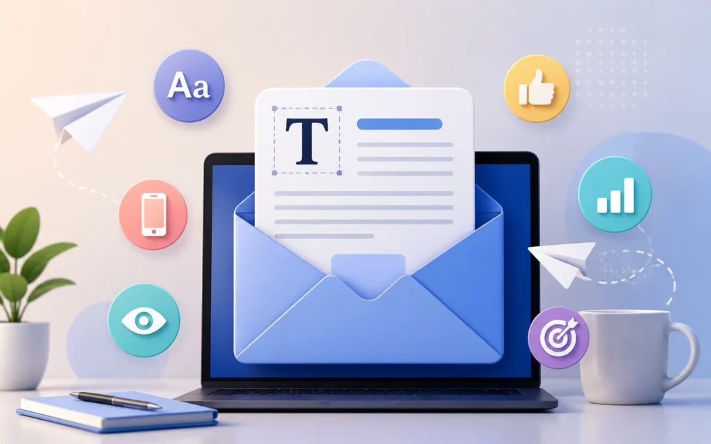
Fonts are not just a design choice in email campaigns, but they directly impact readability, trust, and how quickly your message gets understood.
In email marketing, every second counts, especially when you are sending a welcome email, promotional email, or automated email campaign through an email service provider like TrueSend. The best email fonts improve clarity. A poor one can make even strong content hard to read or unprofessional.
When you use the right email fonts, your message stays clear on mobile, desktop, and tablets, which improves readability. A clear email makes the user quickly understand your email campaign without effort.
Have you noticed that big brands always use a professional email font? This is one of the reasons that people open the email and get impressed with it. Professional email fonts help a brand look trustworthy and structured.
Your well-structured typography decides how users will interact with your email content. Selecting the best fonts keeps readers engaged longer and supports better CTR in your email campaigns.
When you use simple and clean fonts, it becomes easier to scan. While reading a newsletter, users often skim content. So use fonts smartly to improve user experience inside your email templates.
Whether you are sending a welcome email, product update, or any promotional email campaign, when you apply the right fonts, you get a better outcome. Clarity in text encourages action and leads to better conversions.
Email safe fonts are fonts that are pre-installed on most devices and supported by all major email clients. These fonts ensure your email newsletter design and email templates remain consistent everywhere.
Here is the list of email safe fonts:
These fonts are widely used in email marketing campaigns because they minimise display issues and maintain design stability.
When sending business communication or automated workflows through an email service provider like TrueSend, professionalism matters the most.
Here are the most reliable and best fonts for professional emails you can use in your business email.
Arial is one of the most widely used fonts because it’s clean, simple, and easy to read on all screens.
Helvetica is often used for modern brand communication. It gives a polished and structured appearance to the email.
Georgia works well when you need to send longer email content. It adds a formal and editorial tone to your business email.
Verdana is designed for screen readability that supports mobile-first email users.
Calibri is commonly used in business environments and works well for internal or external communication.
These are widely accepted as the best fonts for professional emails because they maintain clarity across devices.
An email newsletter design is not like your regular email campaign. It includes more readable content, updates, and storytelling in an email specifically designed for readers. That’s why the best font for newsletters improves scanning and readability.
Best fonts for newsletters and emails are:
Georgia – It is an elegant serif and great for editorial tone. Georgia font works best for long email reads.
Arial / Helvetica – This font gives a clean, modern, universally supported experience that works best overall clarity.
Verdana – This font contains wide spacing, built for screen readability. It is the best choice for mobile readability.
Trebuchet MS – This font gives a user-friendly feel, good for lifestyle brands. It contains a balanced design structure.
Merriweather – Modern serif designed for screens. You can use Georgia as a fallback.
Besides this, you can also use Raleway, Oswald and Tahoma, which are the best fonts for newsletters. For TrueSend users running email newsletter campaigns, pairing one heading font and one body font is a strong approach.
Check out the example combinations:
In email marketing, font choice can influence engagement rates. Campaigns such as promotions, onboarding emails, and welcome email flows should focus on readability first.
Take a look at the best fonts for email marketing:
You should use multiple fonts in your email marketing campaign for the headline and body copy. Read out what font pair will give an elegant result for email marketing campaigns:
For better results in your email campaign, avoid decorative or script fonts as they often break across email clients.
As an email service provider, TrueSend ensures that email templates are built using email-safe fonts by default.
This helps:
When designing emails in TrueSend, always prioritise fallback font stacks such as Arial, Helvetica, sans-serif.
Do you want to improve your email and make your email look perfect for readers? Stick to these rules that help in conversion and engagement.
You need to follow these simple rules to improve your email performance in 2026.
Too many fonts reduce readability and create visual clutter. So choose 1 or 2 and make that your trusted one.
It is highly important that your text is clearly visible. Keep your body text generally between 14–16px.
Your email heading should stand out, and your body text section should remain simple. Separate fonts will help in clarity.
You should add backup fonts to your email design. It helps when the main font does not load or display properly in some email clients.
Always preview your email campaign before sending it on multiple devices.
Many email marketers lose engagement due to avoidable font issues. Make sure you skip these.
Different types of emails, businesses demand different looks that look aesthetic and respected among the audience. When you select the best fonts for email marketing, keep that in mind. It directly affects how your audience reads and reacts to your message. So it is a big part in email sending through all your complete email campaign.
For TrueSend users, sticking to email safe fonts and professional email fonts confirms that every email campaign, newsletter, and welcome email performs consistently across all inboxes. Let me tell you that simple typography often performs better than complex design. Clarity always wins in email marketing.
1. What are the best email fonts for professional emails?
When you are writing professional emails, you can choose Arial, Helvetica, Verdana, Georgia, and Calibri as fonts. They are readable and support all clients.
2. What are email-safe fonts?
Email-safe fonts are pre-installed fonts like Arial, Times New Roman, and Verdana. It displays consistently across devices and email platforms.
3. Which fonts are best for email newsletters?
Fonts like Arial, Georgia, Verdana, and Trebuchet MS work perfectly for a newsletter. Your newsletter needs clear readability. These fonts are perfect for mobile viewing.
4. Can I use custom fonts in email marketing?
Yes, you can use them, but let me tell you that they may not display in all email clients. That is why it is always recommended to use safe fallback email fonts.
5. Why are fonts important in email campaigns?
Fonts impact readability, CTA, engagement, and brand trust. In email campaigns, a clean font improves user experience and increases response rates.